Top


How, when, and where do users engage with visual search on Bing.com?

 
Green.jpg
IDPFre.jpg

Suggested Searches in the Image Details Page


GOAL

Bring more engagement and awareness to the Visual Search feature.


CHALLENGE

How we can amplify discovery of Visual Search on current entry points?


TIMELINE

4 to 6 weeks


MY ROLE

Work with product managers to clarify business goals

UX flows and wireframes

UI and interaction design

Prototyping

Present designs to stakeholders

Align all explorations to the Bing Design System

Work with UX writing team on all UI text inputs to ensure accessibility

Refine designs and export redlines for development

Communicate with development regarding design edits, refinements, and flight checks

 
Screen Shot 2019-12-01 at 2.14.57 PM.png

ANALYSIS


OPPORTUNITY

Do we see visible opportunities to improve and clarify the UI?

Does it make sense to create a first run experience for new users in certain scenarios?

Perhaps we can introduce new entry points for Visual Search introductions, if it improves the overall search experience and results.


ENTRY POINTS

By bringing awareness to the feature during certain entry points, can we increase feature engagement?

 
CurrentImageAnswer.gif

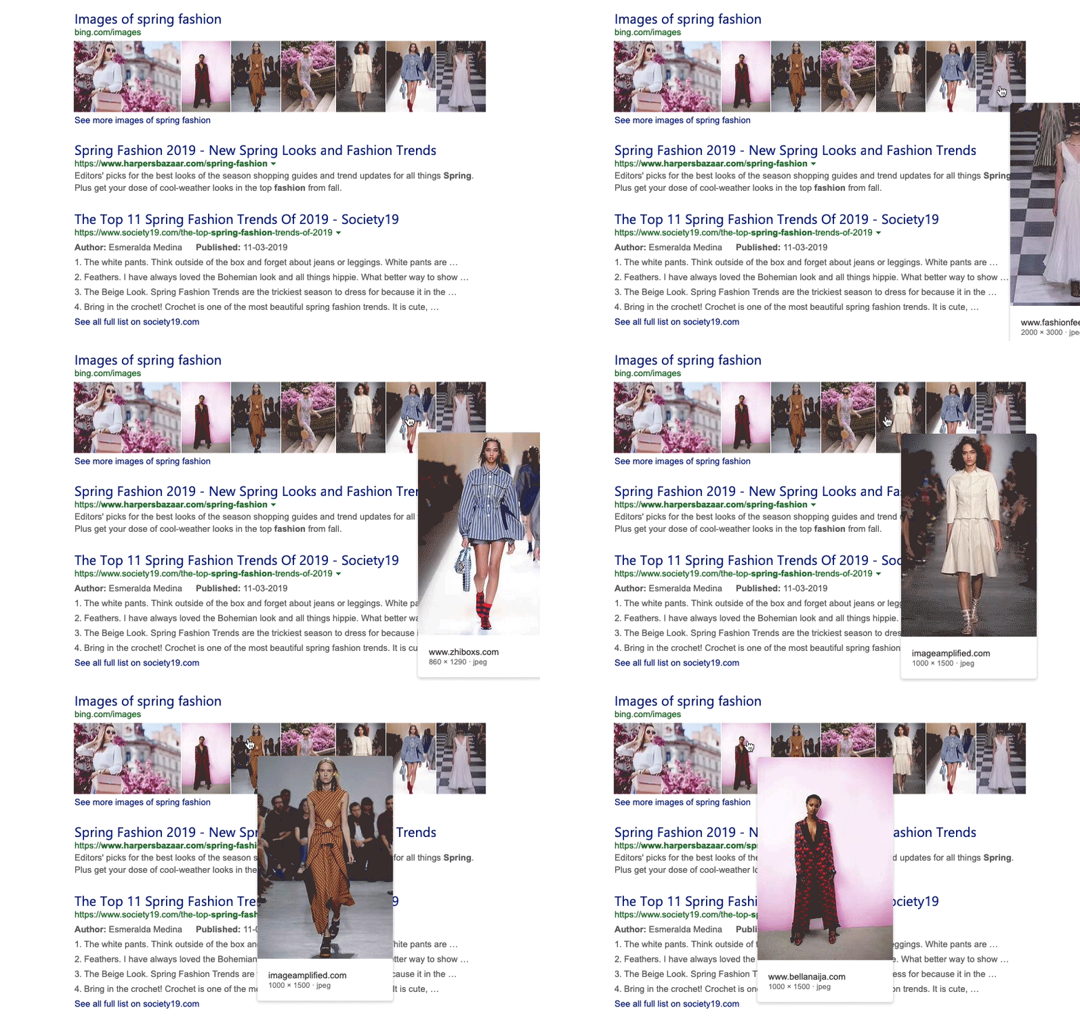
Current image collage hover interaction on search results page


ENTRY POINT #1

A new entry point for consideration, I explored various new treatments for the hover UI on the search results page image answer.


ENTRY POINT #2

A current entry point for visual search, I explored a first run experience for first time visitors of the image details page.


ENTRY POINT #3

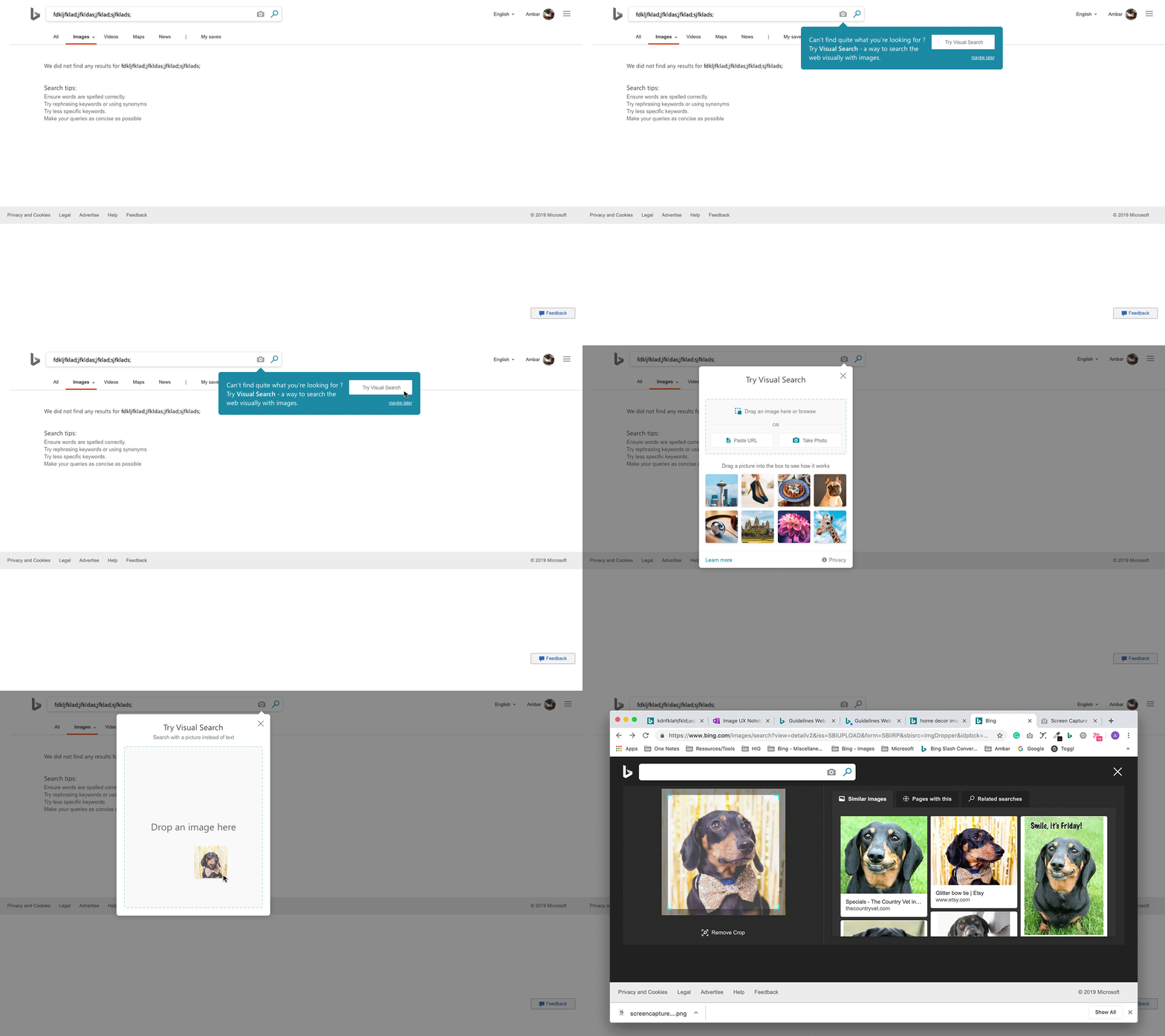
A new entry point for consideration, I explored what a notification to engage with visual search on a no results scenario could look like.


11.png

EXPLORATIONS


IMAGE ANSWER


prototype created in principle


Detail 1

In this exploration, the visual search icon is included in the hover experience. We tested several iterations to ensure the user experience/ icon placement made sense in different image answer scenarios.

Detail 2

Users can now click through to the image results page, or directly engage with visual search on the image of their choice via the Visual Search icon.

 
ImageAnswer_TwoRow.gif

Two row image answer on the search results page – principle prototypE

 
ThreeRowImageAnswer.gif

Three row image answer on the search results page – principle prototypE


IMAGE DETAILS PAGE


prototypE created in principle


detail 1

First time visitors are now introduced to a first run notification.

Detail 2

Users can explore the suggested searches. The notification fades away if not engaged.


phone2_fre.jpg
phone1_fre.jpg

Designs were optimized for mobile and foreign markets


NO RESULTS SCENARIO

 
NOResultsIRP.gif


Detail 1

Currently, users receive a generic notification on the image results page when the query returns no results.

Detail 2

Users now will receive a notification that introduces the opportunity to execute the intended query with an image.


CONCLUSION


AFTER TWO WEEKS OF FLIGHTING

These feature proposals were flighted and tested over a span of two weeks. Overall, unique user engagement increased by .37% on the image details page.


"Styles come and go. Good design is a language, not a style."

Massimo Vignelli