The Challenge
GE Healthcare Digital is working on a project for optimizing patient care in hospitals. How might we most effectively route a hospital patient through his/her journey of care, resulting in higher quality care, patient satisfaction, and operational efficiency?
Key Goals
Understand key patient pain points in a journey of care
Identify patient goals for quality care and satisfaction
Discover key opportunities to increase operational efficiency
Timeline – 6 Days
Field Research
User Research
UX & UI Design

Image Source: unsplash.com/@mroz
“Give people what they need: food, medicine, clean air, pure water, trees and grass, pleasant homes to live in, some hours of work, more hours of leisure. Don’t ask who deserves it. Every human being deserves it”
Research
Field Research, Goals, User Interviews, and Insights
View all my Research here.
Research Goals
Get a basic understanding of the field via online articles and scholarly research to gain potential insights.
Perform interviews regarding hospital experiences as either patients or advocates (family or friends accompanying patient) to reveal pain points and opportunities.
Interview professionals for a provider perspective.
Theory & Hypothesis
From my reading and initial interviews, I formed a theory and developed a hypothesis based on this information.
Theory:
Patient portals provide good information, but patients do not use them for various reasons.
They are difficult to navigate
They are not intuitive
They are not engaging
They don’t provide rewarding feedback to encourage engagement
Hypothesis:
If we improve the patient portal experience, then we can provide a higher level of care, increase operational efficiency, which will result in better patient satisfaction.
“If we improve the patient portal experience, then we can provide a higher level of care, increase operational efficiency, which will result in better patient satisfaction.”
Insights
View all my Research here.
Key Insights
It’s difficult to engage patients without a curated experience that feels member-centered and personal
Patients, and caretakers/ family members feel more in control when they feel like active members of the healthcare team
Underserved individuals often use tech as their main health resource, vs. a health system
Patients need a feeling of control and progress while they wait to be seen
Available data should be leveraged and shared with patients
People are unwilling to continue an activity or change behavior when they don’t see wins stacking
User Feedback
“Patients want to feel safe and in control. This is already a stressful situation. How can we reduce anxiety?”
“Make things clear. Offer information in a digestible way. ”
“Available data should be shared with patients so that they feel in control.”
“Make sure that your information is accessible to those with low literacy or little to no English”
“A universal health care record accessible by all systems would solve so many problems”
“Give information when you can clarifying expectations around wait times”
“Patients and providers need a user-friendly system to manage care options. ”
“It’s hard to keep track of the multiple care team members taking care of my family member. ”

Key Patient and Provider Needs
From my research and interviews, I identified the following key patient and provider needs:
Image Source: unsplash.com/@hush52
“Patients are often disoriented, so information needs to be accessible and bite sized.”
Key Patient Needs
Have a list of all care providers if possible
Reduce anxiety as much as possible with transparency of care
Increase comfort as much as possible
For long wait times, provide access to water, food, basic needs and entertainment if available
Give information that clarifies expectations around wait time
Give information that clarifies what to expect during your stay in the Emergency Room
Make sure your information is accessible to those with low literacy or little to no english
Provide info in a digestible way
Patients are often disoriented, so information needs to be accessible and bite sized
Key Provider Needs
Patients that could be seen at urgent care take up time and space for those patients needing higher triage care.
Preemptive patient education is needed so that patients utilize nurses’ hotline or urgent care.
Patients and providers need a user friendly and efficient system to manage care options.
Available data needs to be leveraged and shared with patients.
Patients need a feeling of control and progress while they are waiting to be seen.
Patients and providers need a user friendly and efficient system to manage care options.
Emergency Rooms are fast paced and stressful environments.
Providers need to be able to input and share information quickly.
Image Source: unsplash.com/@hush52
“Patients need a feeling of control and progress while they are waiting to be seen”
Who is Our Patient?
The Scenario
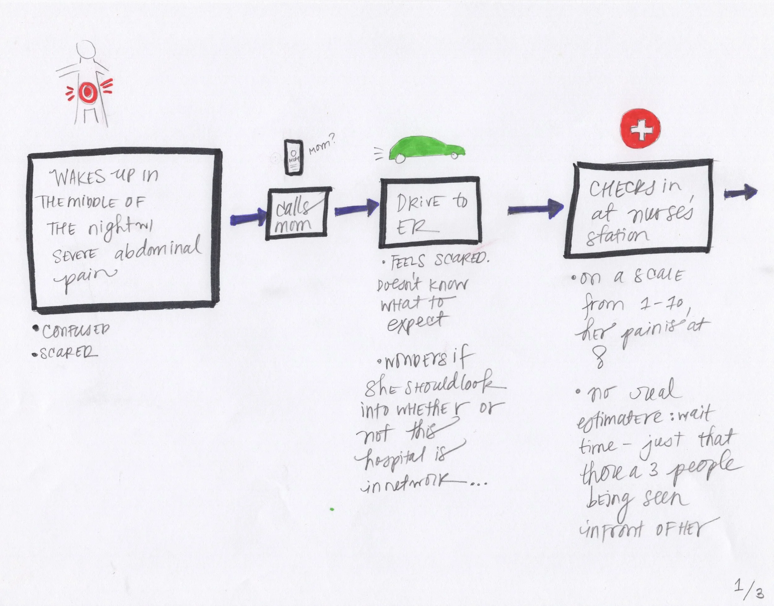
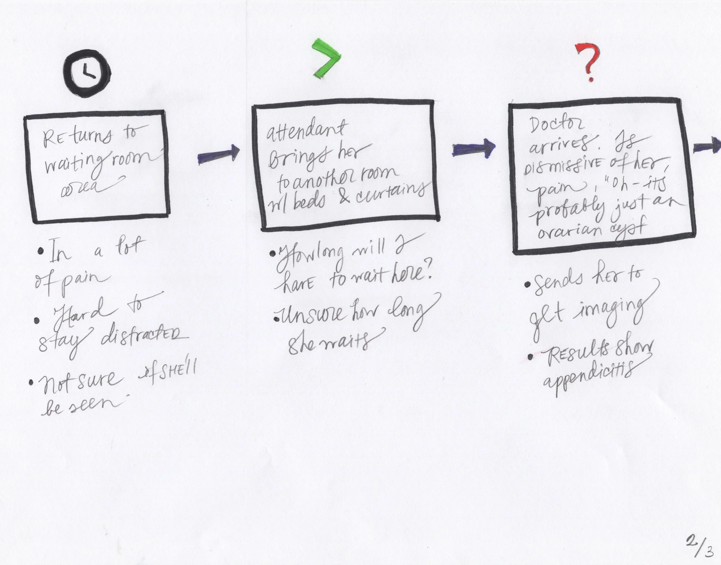
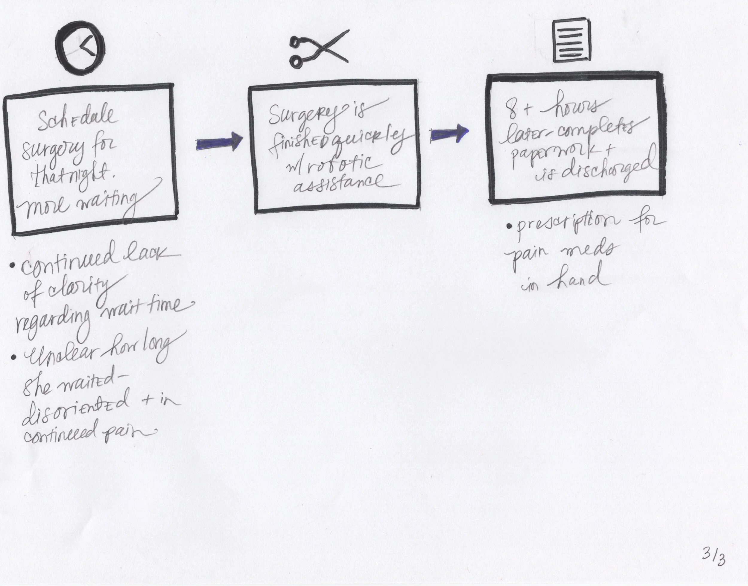
Cynthia has severe abdominal pain, and is taken to the Emergency Room by her mom late at night. She feels scared, anxious, and nervous. She’s never visited the ER either as a patient or companion, so she doesn’t know what to expect.
User Story
As a patient, Cynthia wants a personal and curated experience that’s easy to navigate and makes her feel in control of her care.
User Journey
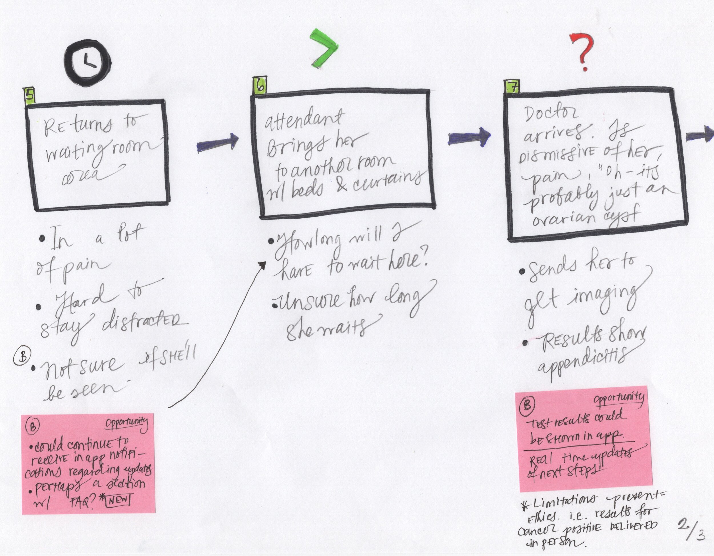
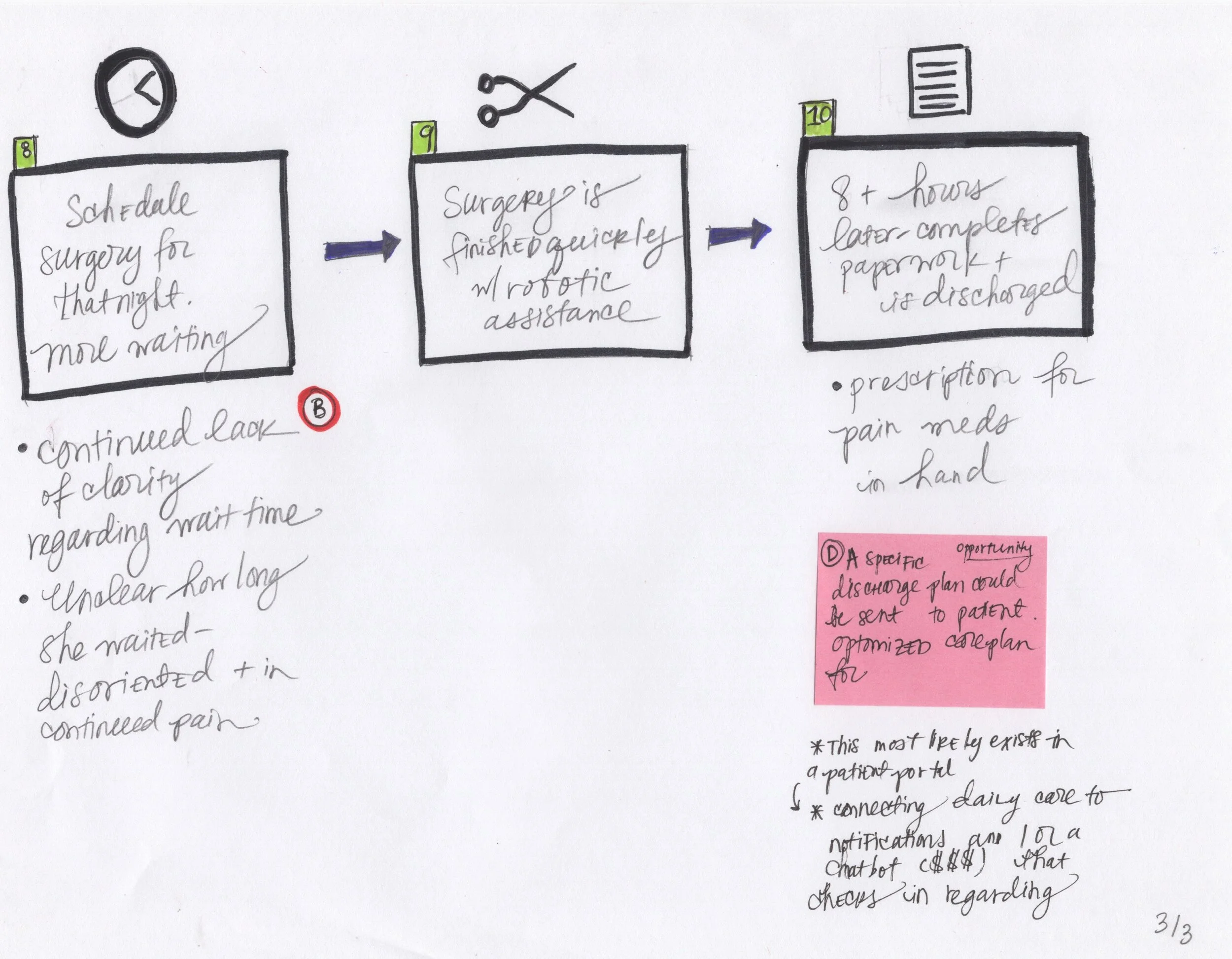
Identifying Opportunities in the User Journey
Based on Cynthia’s User Journey, opportunities were identified to see where a product solution might assist in alleviating parts of Cynthia’s stressful experience.
Design Plan
Create an app that will provide immediate support by providing important real-time updates and information – helping patients feel safer and less anxious during their Emergency Room visits.
To make this app extra accessible – we will build it as a simple progressive web app.
“The share of Americans that own smartphones is now 81% ”
Feature Goals
Real time visualized updates regarding wait times
Ability to connect to personal patient portal
Clear and easy access to a nurse’s hotline
In-app notifications regarding care updates
Section for FAQs
Optimized discharge plan
Easy download at nurse’s station for Apple or Android
Wireframes
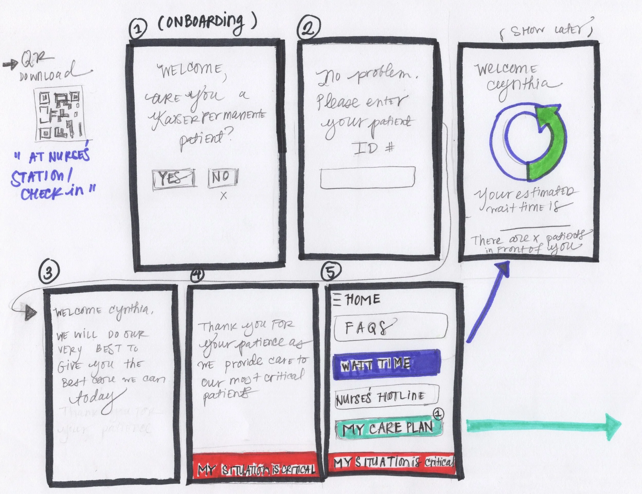
Onboarding Flow
Features Overview
Onboarding
Primary Features
Wait Time
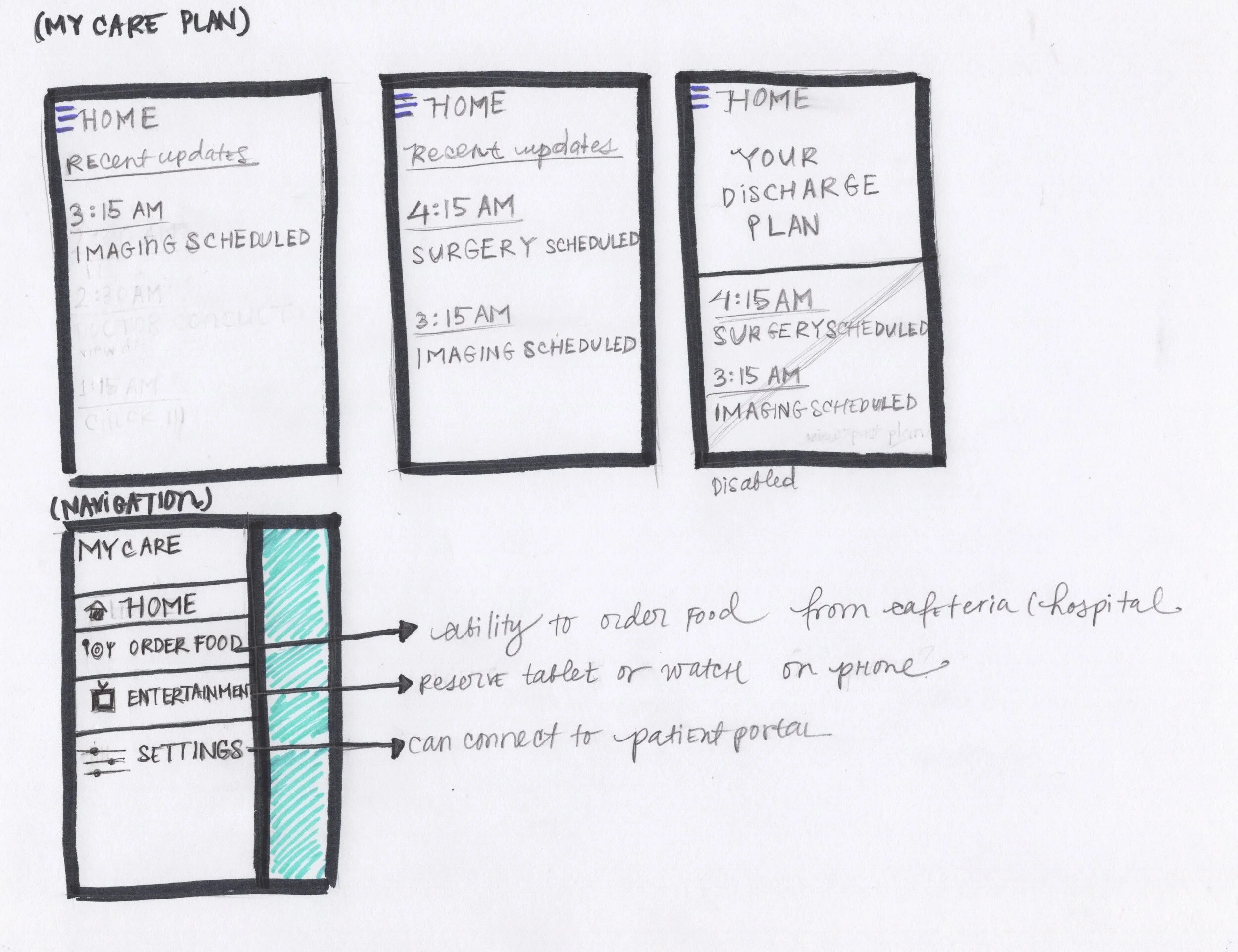
Your Visit
Navigation (Hamburger)
Final Screens
Final Prototype
Video walk through (press play button to view the video)

Conclusion
These are big, and worthy, problems to solve (especially in under a week!). I’m grateful for all the individuals that let me into their experiences and provided me with the insights and guidance that helped me define and focus on a scenario that would allow for small wins.
This concept app has the potential to help patients feel both safer and more in control of their ER experience by leveraging and empowering patients by providing them with important data.
Final Thoughts
I learned so much from my user interviews and reading. These are a few items and concepts I would look into closer, were I to continue work on this product.
What Seems to Be Working
Medical Scribes - Provide doctors with a scribe, someone who can be recording all the information that is being exchanged during a patient’s visit.
Medical Consultants - A patient advocate, someone whom a patient can share diagnosis and clinical information with and will provide educated questions to present back to the primary care provider.
Twistle - Apps like twistle are trying to help patients follow their care plan with in app notifications and reminders.
What Needs to be Re-examined
Universal Electronic Health Record - A record that works across all EHR systems would solve a lot of these inconsistencies and pain points for both providers and patients.
Insurance Companies - Doctors don’t get compensated for the time they spend piecing together paper records, records from various EHR networks, etc. This means they often spend time at home catching up on paperwork at the end of an already long and demanding work day.
Patient Portals - If these tools are not equally optimized for providers, they will continue to be inefficient communication and record keeping tools for patients.
Next Steps
User Testing
Continue further product validation via user testing, iterating, and more interviews.
In-App Notifications and First Run Experience
Explore and test UI notifications for updates as well as a first run experience explaining all the app features upon sign in.
I would also explore adding elements of motion design (like the heart filling in as the splash screen loads).
My Files
All my process and source files can be viewed here
Research
References
Sources | Online
The future of patient portals https://www.medicaleconomics.com/business/future-patient-portals
Behavior Change Theorem: Using a debt model to promote whole patient health https://www.medicaleconomics.com/news/behavior-change-theorem-using-debt-model-promote-whole-patient-health?utm_source=bibblio_recommendation
How mobile tech is transforming healthcare https://www.medicaleconomics.com/med-ec-blog/how-mobile-tech-transforming-healthcare?utm_source=bibblio_recommendation
A Doctor’s Diary: The Overnight Shift in the E.R. (Essay) https://www.nytimes.com/2019/12/16/health/emergency-room-medicine.html?auth=linked-facebook
Sources | Scholarly
Patient Portals and Patient Engagement: A State of the Science Review https://www.jmir.org/2015/6/e148/ Cited by 330
The Impact of Electronic Patient Portals on Patient Care: A Systematic Review of Controlled Trials https://www.jmir.org/2012/6/e162/ Cited by 14
Electronic patient portals: evidence on health outcomes, satisfaction, efficiency, and attitudes: a systematic review https://www.ncbi.nlm.nih.gov/books/NBK169589/ Cited by 348


